Monday, 25 April 2016

Week 9

This week we talked about Concept art and what it is used for and why it is created, concept art are used to show ideas in a visual medium so it can show of characters, scenes landscapes. these concept art pieces can then be used to in the game as unlock able extras, they can be released to get some hype for the game and inspire and show modellers and other people who are working on the game/film/etc how something should look.

Yoji Shinkawa- he  has created some of my favourite pieces of concept art for my favourite games series Metal gear solid, he designs a lot of the characters himself and I think that he has a very unique style to what he creates.


Matt Rhodes- He has created some very cool pieces of concept art for the Dragon Age games. 


Week 8

this week we talked about photo manipulation, we were told about things like how to combine two different images together to get something more interesting, how to alter the colours for a more natural looks image and adding effects.
we also looked at some character design sheets and what we would need to add to ours for it to look good and be handled in. we would need some poses of our character that shows all of there body so we need several poses from different angles.

Week 7

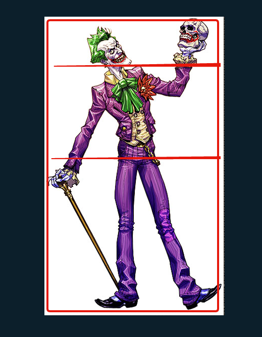
This week we focused on the rule of thirds where we divide the picture up in thirds and break it down piece by piece, the reason they do this is to focus the picture in and make it more appealing to the viewer. We also discussed divine proportion where they used a golden rectangle that is a mathematical equation that is found through the world in such things as sea shells, faces etc.


In this picture of the Joker I have used the lines to separate his body parts so that they can be easier analysed, the Joker has a quite slim frame which goes quite well with his overall jester look he has going on he doesn't look like a fighter since he looks quite physically week, the pose he has is also quite strange and it seems quite hard to take him serious on the first glance.  


Week 6

This week we learnt about saturation, value and hue of colour, like what colours go well with each other and which don`t. we were provided with a chart which showed us what colours would best go together.
for the sessional task we were tasked with creating a line drawing and colouring it with the colours that were supplied to use before, here is the line drawing that I created.


.

week 5

This week we learnt about perspective drawing and how they are used 

Week 4

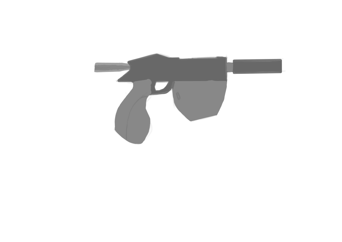
For the sessional task this week I was tasked with doing a outline and creating a silhouette of a object one we could perhaps use for the props for our character.

Week 3

This week in the lesson we discussed colour composition and how to use it, what colours work best in a drawing. We also discussed a design process where we break an image up in two or three sections, the fore ground, middle ground and background and then try and make the images your own.

We did this by making them into separate layers and then experimenting with some of the colours and different shades of colours, I also places some new images on there and tried to blend them into the environment.